Choosing the right paint colors for your home’s interior can feel overwhelming. You want colors that make your space feel comfortable, stylish, and truly yours.
But with so many options, how do you pick the perfect shades? This guide will help you understand the key factors to consider, so you can confidently select colors that brighten your rooms and reflect your personality. Keep reading to discover simple tips that will transform your home and make every room inviting.

Credit: www.goodhousekeeping.com
Factors To Consider
Consider the room’s size, lighting, and furniture before choosing paint colors. Think about the mood you want to create and how colors will match your decor.
Choosing the right paint colors for your home’s interior involves several important factors. Understanding these can help create a harmonious and visually appealing space. These elements ensure the chosen colors enhance your home’s ambiance.Lighting Effects
Light impacts how colors appear in a room. Natural light changes throughout the day, affecting the color’s tone. Consider the direction your windows face. North-facing rooms may need warmer shades to balance cooler light. Artificial lighting also plays a role. Different bulbs can alter color perception. Test paint samples under varied lighting conditions.Room Size And Shape
Colors can influence how large or small a room feels. Light shades make a room feel spacious. Dark colors can add intimacy to large spaces. Consider the room’s shape. Long, narrow rooms benefit from accent walls to break the space. Use color strategically to enhance or minimize architectural features.Existing Furniture And Decor
Consider your current furniture and decor when selecting colors. Your paint should complement your existing items. Neutral colors often work well, providing flexibility. Bold colors can create a focal point. Choose shades that highlight your favorite pieces. Coordination ensures a cohesive look.Mood And Atmosphere
Colors set the mood of a room. Soft blues and greens evoke calmness. Bright reds and oranges energize a space. Think about how you want each room to feel. Bedrooms may benefit from relaxing tones. Living areas might use vibrant hues for social gatherings. Consider your emotional response to colors.Popular Color Schemes
Choosing the right paint colors sets the mood of your home’s interior. Popular color schemes guide many homeowners. They provide a clear path to a balanced and stylish look. Each scheme creates a unique atmosphere. Some bring calmness, while others add energy. Explore these common options to find what fits your space best.
Neutral Tones
Neutral tones include shades like beige, gray, white, and taupe. They create a calm and timeless backdrop. These colors work well with almost any décor style. Neutrals make rooms feel spacious and clean. They also allow furniture and artwork to stand out. Perfect for living rooms and bedrooms that need a peaceful vibe.
Bold And Vibrant Colors
Bold colors include reds, blues, greens, and yellows. They bring energy and personality to a room. Use them to make a statement or highlight a feature wall. These colors can inspire creativity and excitement. Ideal for playrooms, kitchens, or areas where you want to feel lively. Balance bold shades with neutral accents to avoid overwhelming the space.
Pastel Shades
Pastels are soft, light colors like pale pink, mint green, and baby blue. They create a gentle and soothing atmosphere. Perfect for bedrooms, nurseries, and bathrooms. Pastels brighten a room without being too intense. These colors pair well with white trim and natural wood tones. They help make small spaces feel airy and fresh.
Monochromatic Palettes
Monochromatic palettes use different shades of the same color. This approach brings harmony and depth to a room. It avoids color clashes and keeps the design simple. For example, varying blues or grays create a cohesive look. Layer textures and finishes to add interest. Works well in modern and minimalist interiors.
Testing Paint Colors
Testing paint colors is a crucial step before committing to a full room makeover. It helps you see how colors really look on your walls and react to your home’s lighting. This practice prevents costly mistakes and ensures you pick a color that fits your style perfectly.
Sample Swatches
Start with small paint swatches on your wall. These come in small cards or peel-and-stick samples. Place several colors side by side. This lets you compare shades directly under the same lighting.
Choose swatches that catch your eye. Test colors in rooms where you spend the most time. This makes the color choice more personal and practical.
Paint Small Sections
Apply paint to a small wall area. Use a 12-inch square or a section behind furniture. This shows how the color looks on a larger surface. It helps you notice texture and coverage differences.
Paint multiple sections with different colors to see which one feels best. Let the paint dry completely for true color display. This step is key to avoid surprises after painting the entire room.
Observe At Different Times
Colors change with natural and artificial light. Look at your painted samples in the morning, afternoon, and evening. Notice how sunlight or lamps affect the hue.
Check colors under different weather conditions too. Bright sunlight can make colors look brighter. Cloudy days soften the tone. This helps find a color that feels right all day long.
Use Paint Visualizer Tools
Online paint visualizers let you try colors digitally. Upload a photo of your room or use preset images. This gives a quick preview of how colors match your decor.
These tools are easy to use and free. They offer many color options and combinations. Use them to narrow down choices before testing physical samples.
Color Combinations And Accents
Choosing the right color combinations and accents can transform any room. They set the mood and highlight your style. Using smart combinations creates harmony and balance in your space. Accents add personality and draw attention to key areas.
Complementary Colors
Complementary colors sit opposite each other on the color wheel. This contrast makes each color pop. Use these pairs to create bold and lively rooms. Examples include blue and orange, red and green, or yellow and purple. Pairing these colors carefully prevents the space from feeling overwhelming.
Analogous Colors
Analogous colors lie next to each other on the color wheel. They create a calm and cohesive look. Choose two or three shades that blend well. For instance, blue, blue-green, and green work great together. This scheme adds depth without harsh contrasts.
Accent Walls
An accent wall uses a different color to highlight one wall. It brings focus and breaks monotony. Pick a bold or darker shade for the accent wall. Keep other walls neutral to balance the room. Accent walls work well in living rooms, bedrooms, or dining areas.
Trim And Ceiling Colors
Trim and ceiling colors frame the room’s main colors. White or off-white trim brightens and defines edges. Light ceiling colors create an open, airy feel. Darker ceiling tones add coziness and interest. Choose trim and ceiling shades that complement the walls for a polished look.
Trends And Timeless Choices
Choosing paint colors for your home’s interior involves balancing style trends with lasting appeal. Trends bring freshness and personality. Timeless colors offer stability and harmony. Combining both helps create rooms you enjoy today and tomorrow.
Current Popular Colors
Soft neutrals like beige and light gray remain popular choices. They create calm and spacious feeling. Earthy tones such as terracotta and olive green add warmth. Cool blues and gentle pastels bring peace and brightness. These colors reflect nature and comfort.
- Beige and light gray for versatile backgrounds
- Terracotta and olive green for cozy warmth
- Soft blues and pastels for calm and light
Classic And Timeless Hues
White and off-white shades never go out of style. They brighten rooms and match any decor. Navy blue offers depth without overwhelming space. Warm taupe and soft greige blend beige and gray well. These colors work in any room or setting.
- White and off-white for clean, bright spaces
- Navy blue for strong, elegant accents
- Warm taupe and greige for balanced neutrality
Balancing Trendy And Durable
Use trendy colors on smaller walls or accents. It keeps the look fresh without risk. Pair bold hues with neutral bases for balance. Choose durable finishes for high-traffic areas. This approach offers style and longevity.
| Strategy | Benefit |
|---|---|
| Accent walls with trendy colors | Adds personality without overwhelming |
| Neutral main walls | Supports flexible decor changes |
| Durable paint finishes | Ensures long-lasting beauty |

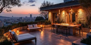
Credit: stylebyemilyhenderson.com
Practical Tips
Choosing the right interior paint colors requires more than picking a shade. Practical decisions about finish, upkeep, expert help, and budget play a key role. These tips help make smart choices for a beautiful, lasting space.
Choosing Finish Types
Paint finishes affect look and durability. Matte hides flaws well but is hard to clean. Satin offers a soft shine and cleans easily. Semi-gloss shines more and resists moisture, ideal for kitchens and bathrooms. Gloss is very shiny and durable but shows imperfections. Pick finishes based on room use and style.
Considering Maintenance
Think about how often walls need cleaning. High-traffic rooms need washable paints. Avoid flat finishes in areas prone to dirt. Scrubbable paint saves time and effort. Choose colors that mask stains to reduce visible marks.
Working With Professionals
Painters and color consultants bring experience. They suggest colors that suit light and space. Professionals ensure smooth, even coats without streaks. Ask for samples or small test patches. Their advice can prevent costly mistakes.
Budgeting For Paint Projects
Set a clear budget before buying paint. Higher quality paint often covers better and lasts longer. Factor in tools and labor costs if hiring help. Plan for extra paint for touch-ups. Budgeting carefully avoids surprises and keeps the project on track.

Credit: jeffschultzpainting.com
Frequently Asked Questions
How Do I Pick The Right Interior Paint Color?
Choose colors based on room size, lighting, and mood. Test samples on walls before finalizing. Consider color psychology and existing décor for harmony.
What Are The Best Paint Colors For Small Rooms?
Light colors like soft whites, pale blues, or light grays make small rooms feel larger and brighter. Avoid dark shades to prevent a cramped feeling.
How Can I Match Paint With Furniture?
Use paint colors that complement your furniture tones. Neutral walls work well with bold furniture. Alternatively, pick accent colors from fabric patterns for cohesion.
Should I Consider Paint Finish Types Indoors?
Yes, different finishes suit different rooms. Matte hides imperfections, gloss is durable for kitchens. Satin offers a balance of sheen and washability.
Conclusion
Choosing the right paint color makes your home feel warm and inviting. Think about the room’s purpose and natural light. Test small patches before painting the whole wall. Match colors with your furniture and style. Simple steps lead to great results.
Enjoy the process and trust your taste. Your perfect color will make your space feel like home.