Choosing the right interior paint colors can transform your home and lift your mood every time you walk in. But with so many shades and tones, it’s easy to feel overwhelmed or make a choice you’ll regret.
What if you could pick colors that not only look great but also make your space feel exactly how you want it—calm, energizing, or cozy? You’ll discover simple steps and insider tips to help you select paint colors that match your style and personality perfectly.
Keep reading, and you’ll never worry about choosing the wrong color again.
Choosing The Right Base Color
Choosing the right base color sets the tone for your entire room. It influences mood, lighting, and furniture choices. A good base color creates harmony and balance in your space. It helps other colors stand out without overwhelming the room.
Warm Vs Cool Tones
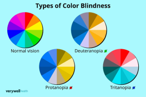
Warm tones include reds, yellows, and oranges. They make a room feel cozy and inviting. These colors work well in living areas and bedrooms. Cool tones like blues, greens, and purples create calm and relaxing spaces. They suit bathrooms and offices best. Consider the room’s purpose before choosing warm or cool tones.
Neutral Shades As Foundations
Neutrals form the perfect base for any style. Whites, grays, beiges, and taupes are popular neutral choices. They blend well with both warm and cool accents. Neutrals allow flexibility in decorating and easy updates. Use neutral shades to create a clean and spacious feel. They help highlight artwork and colorful furniture.
Credit: www.angi.com
Considering Room Size And Lighting
Choosing the right paint color depends heavily on the room’s size and lighting. These two factors influence how a color looks on your walls. Small rooms and dim lighting can make some colors feel heavy or dull. Larger rooms and bright light can help colors pop and feel lively. Understanding these effects helps pick a color that suits your space perfectly.
Effects Of Natural Light
Natural light changes throughout the day. Morning light is cool and blue-toned. Afternoon light is warm and yellow-toned. This shift affects how paint colors appear on your walls.
Rooms with lots of sunlight make colors look brighter and more vibrant. Dark rooms with little natural light can make colors look dull or muddy. South-facing rooms get strong light, making colors feel warmer. North-facing rooms have cooler light, which can make colors seem cooler or grayer.
Consider the amount and direction of natural light when selecting paint colors. Test paint samples at different times of the day to see how they change.
Using Color To Alter Perception Of Space
Paint colors can make rooms feel bigger or smaller. Light colors like white, cream, or pale blue reflect light. They open up a small room and make it feel spacious.
Dark colors like navy, charcoal, or deep green absorb light. They make large rooms feel cozy and intimate. Bold colors can add drama but may shrink a small space.
Use these tips to change how a room feels:
- Light colors for small rooms or low light
- Dark colors for large rooms or bright light
- Glossy finishes reflect more light and add brightness
- Matte finishes create a soft, cozy feel
Matching Paint With Furniture And Decor
Choosing the right paint color means thinking about your furniture and decor. The paint should create harmony in the room. It should highlight your furniture without clashing with it. Colors can bring warmth, calm, or energy depending on the choice. Matching paint with your decor helps make the space inviting and balanced.
Complementary Color Schemes
Complementary colors sit opposite on the color wheel. They create strong contrast and make each color pop. For example, blue walls work well with orange accents in furniture. Use this scheme to highlight key pieces. Keep most colors neutral to avoid overwhelming the room.
- Choose one dominant color for walls.
- Use its complement in smaller decor items.
- Balance bright colors with soft neutrals.
Balancing Bold And Subtle Hues
Bold colors grab attention but can dominate a room. Subtle hues create calm and let furniture shine. Use bold paint on one wall or in small rooms. Pair it with furniture in neutral or muted tones. Soft paint colors work well with bold or patterned furniture.
- Use bold colors for accents and statement walls.
- Choose subtle shades for larger walls and background.
- Mix textures and materials to add depth.
)
Credit: www.homedepot.com
Trends And Timeless Choices
Choosing the right interior paint colors can be both exciting and overwhelming. Trends come and go, but some color choices remain timeless. Knowing how to balance trendy hues with classic shades can transform your space, ensuring it feels fresh yet enduring.
Popular Current Palettes
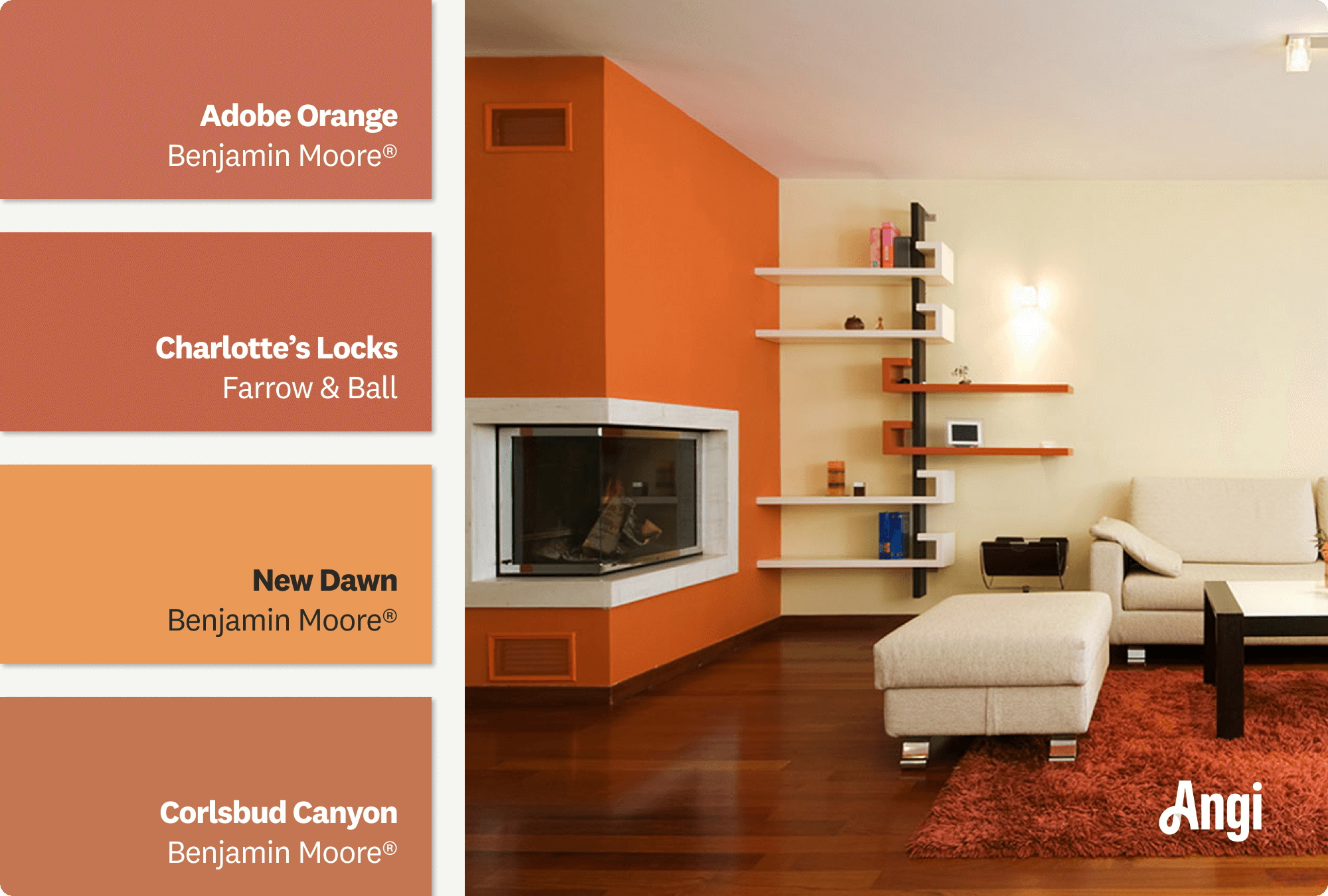
Today’s color trends often reflect our collective moods and desires. Earthy tones are making a big splash, bringing warmth and comfort into homes. Think terracotta, olive greens, and deep browns. On the flip side, soft pastels like blush pink and muted lavender create a serene, calming atmosphere.
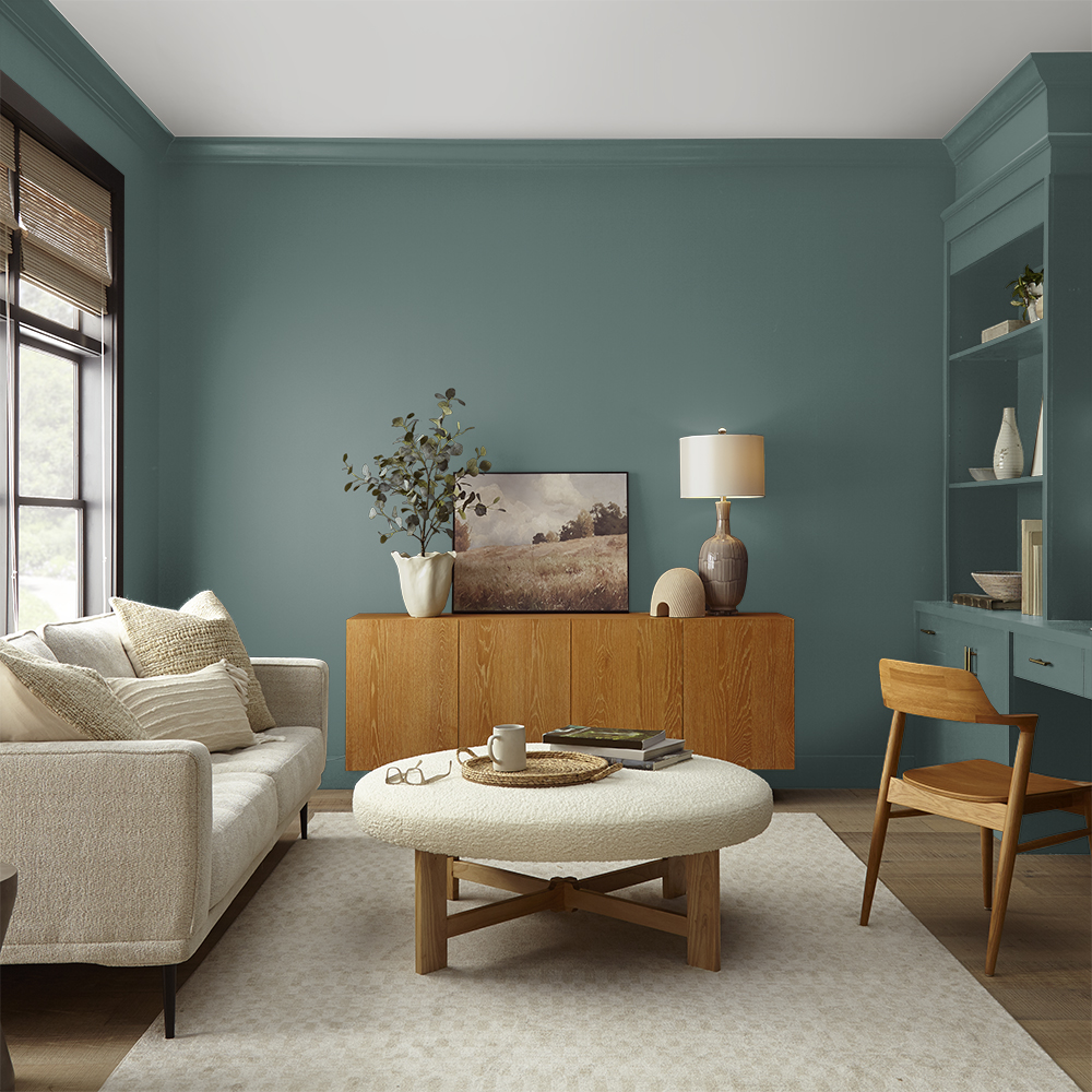
Bold colors are also having a moment. Rich jewel tones such as emerald green and sapphire blue add a dramatic flair to living rooms and bedrooms. These colors can make a space feel luxurious and inviting.
Consider incorporating these trendy palettes in your home. A feature wall or a piece of furniture painted in a trendy color can be a great starting point. What trendy color speaks to you?
Classic Colors That Never Fade
While trends are fun, classic colors offer longevity. Whites, creams, and beiges are the unsung heroes of interior design. They provide a neutral backdrop that complements any style or decor.
Grays continue to be a favorite for many. They offer versatility, blending well with both warm and cool tones. Whether you prefer light gray or charcoal, this color never goes out of style.
Another timeless choice is navy blue. It’s bold yet sophisticated and pairs beautifully with a variety of colors. You can use it to create a nautical theme or as a statement color in a modern setting.
Why not mix a classic color with a trendy one to create a unique look? Your home can tell a story through its colors.
Testing Colors Before Painting
Testing paint colors before painting helps avoid costly mistakes. It shows how colors look on actual walls. Colors can appear different on paper and walls. Testing gives a clear idea of the final look. It helps pick a color that fits your space and lighting.
Sample Swatches On Walls
Paint small swatches on different walls. Choose spots that get various light levels. Use a brush or roller to apply paint in a 12×12 inch square. Let the paint dry fully. Check the color in natural and artificial light. This reveals true color and texture. Try multiple colors to compare side by side.
Observing Colors At Different Times
Look at the swatches during morning, afternoon, and night. Colors change with sunlight and room lighting. Morning light is cooler and softer. Afternoon light is bright and warm. Evening light often casts shadows and changes hues. Note how the color feels at each time. This helps pick a color that suits all times of day.
Using Accent Walls And Color Blocking
Using accent walls and color blocking can transform your space without overwhelming it. These techniques help you play with color in a way that adds personality and depth. You don’t have to paint every wall the same color to make a statement or create a cohesive look.
Creating Focal Points
Accent walls draw attention to a specific area, making it the star of the room. You might choose the wall behind your bed, fireplace, or a large piece of artwork. Picking a bold or contrasting color here helps guide the eye and adds a layer of interest.
Think about what you want to highlight in your room. Maybe a calming blue behind your sofa or a rich mustard in a reading nook. It’s your chance to express style without painting the entire room.
Mixing Colors For Visual Interest
Color blocking involves using two or more solid colors in large, geometric sections. This approach can make a room feel modern and dynamic. You can try pairing complementary colors like navy and coral or stick to different shades of the same color family for a subtler look.
Try dividing walls horizontally or vertically with painter’s tape to create clean, sharp lines. This technique gives you a chance to experiment with colors you might not usually consider together. How could you use this to energize a dull hallway or add warmth to a kitchen?
Choosing Finish Types
Choosing the right paint finish can change the entire look and feel of your room. It affects how light reflects off the walls and how easy it is to clean them. Understanding different finish types helps you pick one that suits your lifestyle and design preferences.
Matte, Satin, And Glossy Options
Matte finishes have a flat, non-reflective surface that hides imperfections well. They are perfect for low-traffic areas like bedrooms where you want a soft, elegant look. However, matte paint is less durable and can be harder to clean.
Satin finishes offer a slight sheen, giving walls a smooth, velvety appearance. They balance style and practicality, making them great for living rooms or dining areas. Satin is easier to wipe down than matte but still hides minor flaws.
Glossy finishes shine brightly and reflect a lot of light, making spaces feel larger and more vibrant. Use glossy paint on trim, doors, or cabinets to add a polished touch. Keep in mind, glossy surfaces show scratches and dents more easily, so they may need more upkeep.
Durability And Maintenance Factors
Think about how much wear and tear your walls will face. Kitchens and bathrooms demand finishes that resist moisture and stains, so satin or glossy paints often perform better here. You don’t want to repaint frequently because the finish can’t handle cleaning.
Matte finishes might look beautiful but tend to absorb stains and mark easily. If you have kids or pets, you might find yourself constantly touching up walls painted with matte finishes. Ask yourself: how much cleaning will your walls need?
Glossy paints are the easiest to clean, but their shininess can highlight every imperfection. This means surface preparation must be thorough before painting. Consider how much effort you’re willing to invest in maintenance before choosing a high-gloss finish.

Credit: www.angi.com
Frequently Asked Questions
What Factors Should I Consider When Choosing Paint Colors?
Consider lighting, room size, furniture, and mood. Natural light changes color appearance. Match colors to your décor and desired atmosphere.
How Do Paint Colors Affect Room Perception?
Light colors make rooms appear larger and brighter. Dark colors add coziness but can make spaces feel smaller. Choose based on room function and size.
Can I Test Paint Colors Before Buying?
Yes, use sample pots to test colors on walls. Observe them in different lighting throughout the day to ensure satisfaction.
What Are Popular Interior Paint Color Trends?
Neutral tones like beige, gray, and soft whites remain popular. Bold colors like navy and emerald add depth and style to spaces.
Conclusion
Choosing the right paint color can change your home’s feel. Think about the room’s purpose and lighting first. Test colors with small patches on your walls. Choose shades that make you feel calm and happy. Don’t rush; take your time to decide.
Paint colors help create a space you love. Trust your instincts and enjoy the process. Your perfect color is waiting to brighten your home.